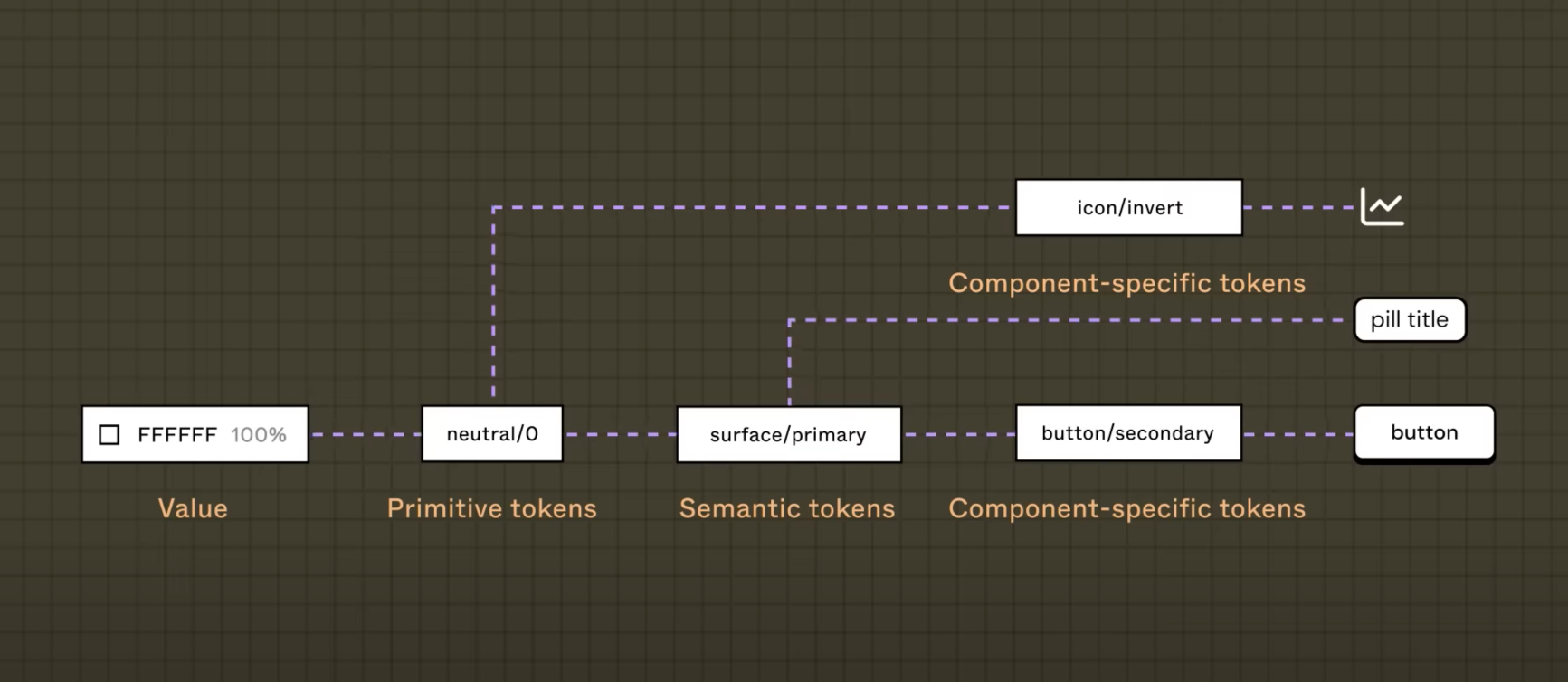
Tokens are variables that represent design decisions such as color, typography, and spacing, in a consistent and reusable way.
Foundation
This is some placeholder content for the scrollspy page. Note that as you scroll down the page, the appropriate navigation link is highlighted. It's repeated throughout the component example. We keep adding some more example copy here to emphasize the scrolling and highlighting.
TBD
Actions
Bootstrap has a base .btn class that sets up
basic styles such as padding and content alignment. By
default, .btn controls have a transparent border
and background color, and lack any explicit focus and hover
styles.
Group a series of buttons together on a single line or stack them in a vertical column.
TBD
Communication
Material Symbols are our newest icons consolidating over 3,209 glyphs in a single font file with a wide range of design variants. Symbols are available in three styles and four adjustable variable font styles (fill, weight, grade, and optical size).
Indicate the loading state of a component or page with Bootstrap spinners, built entirely with HTML, CSS, and no JavaScript.
Using a series of utilities, you can create this jumbotron, just like the one in previous versions of Bootstrap. Check out the examples below for how you can remix and restyle it to your liking.
Using `container queries` to create a card or dashboard type layout.
Provide contextual feedback messages for typical user actions with the handful of available and flexible alert messages.
Documentation and examples for badges, our small count and labeling component.
Badges scale to match the size of the immediate parent element by using relative font sizing and em units. As of v5, badges no longer have focus or hover styles for links.
Use Bootstrap's JavaScript modal plugin to add dialogs to your site for lightboxes, user notifications, or completely custom content.
Below is a static modal example (meaning its
position and display have been
overridden). Included are the modal header, modal body
(required for padding), and modal footer
(optional). We ask that you include modal headers with dismiss
actions whenever possible, or provide another explicit dismiss
action.
As mentioned above, you must initialize tooltips before they can be used. One way to initialize all tooltips on a page would be to select them by their data-bs-toggle attribute.
Push notifications to your visitors with a toast, a lightweight and easily customizable alert message. Toasts are lightweight notifications designed to mimic the push notifications that have been popularized by mobile and desktop operating systems. They're built with flexbox, so they're easy to align and position.
Lists
The accordion uses
collapse
internally to make it collapsible. To render an accordion
that's expanded, add the .open class on the
.accordion.
Used for showing pagination to indicate a series of related
content exists across multiple pages. We use a large block of
connected links for our pagination, making links hard to miss
and easily scalable—all while providing large hit areas.
Pagination is built with list HTML elements so screen readers
can announce the number of available links. Use a wrapping
nav element to identify it as a navigation
section to screen readers and other assistive technologies.

